
Instagram’s Old vs New Sizes in 2026: How the Change Is Impacting Your Reach
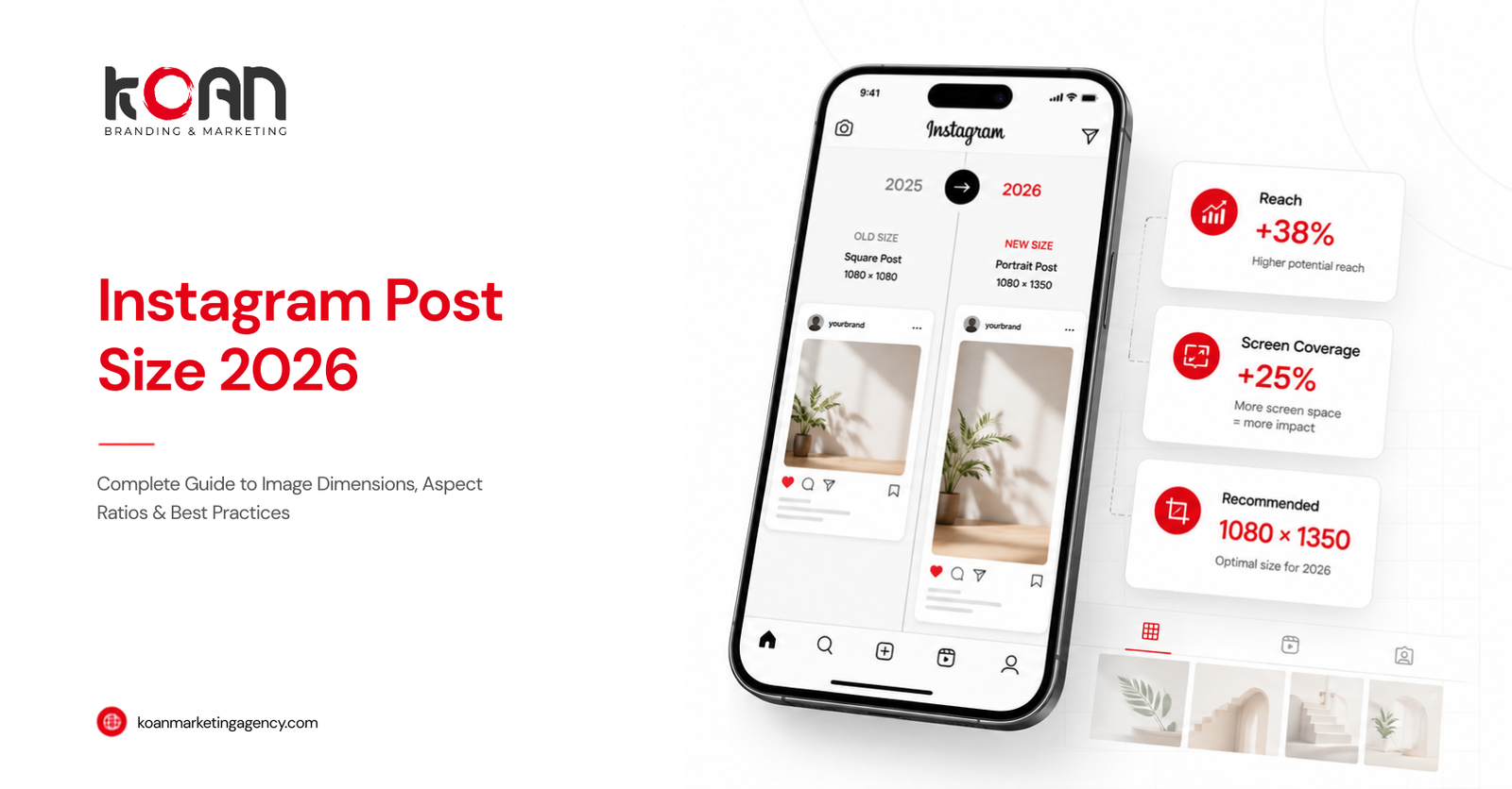
Quick answer: Instagram shifted from the classic 1:1 square format to a taller, vertical-first system. Feed posts now display best at 4:5 (1080 x 1350 px) instead of the old 1:1 square, and the profile grid preview – square since 2010 – now crops everything to 3:4, a change Instagram’s Head of Instagram, Adam Mosseri, confirmed directly. Content still designed for the old square specs gets cropped, loses screen real estate, and gets deprioritized by an algorithm that rewards posts filling the mobile screen and holding attention longer. Reels (9:16, 1080 x 1920 px) remain the single highest-reach format on the platform.
If your engagement has quietly dropped over the last few months and you haven’t changed anything else about your content strategy, your image dimensions are one of the first places to look. Here’s exactly what changed, why it affects reach, and how to fix it – content by content, format by format.
Old Sizes vs New Sizes: The Direct Comparison
| Content Type | Old Standard | Current (2026) Standard | What Changed |
|---|---|---|---|
| Feed post | 1:1 square (1080 x 1080 px) | 4:5 portrait (1080 x 1350 px) | Taller format now recommended for max screen coverage |
| Profile grid preview | 1:1 square thumbnail | 3:4 vertical crop | Instagram auto-crops every grid thumbnail to 3:4, regardless of upload ratio |
| Landscape post | 1.91:1 (1080 x 566 px) | Still supported, rarely optimal | Landscape now underperforms vertical formats for reach |
| Stories | 9:16 (1080 x 1920 px) | 9:16 (1080 x 1920 px) | Unchanged – still the full-screen standard |
| Reels | 9:16 (1080 x 1920 px) | 9:16 (1080 x 1920 px), now runs much longer | Ratio unchanged, but max length and distribution rules evolved |
| Carousels | Matched first-slide ratio (often 1:1) | Matched first-slide ratio, now typically 4:5 | Same mechanic, different default ratio |
| Profile picture | 320 x 320 px (1:1) | 320 x 320 px (1:1) | Unchanged |
The pixel width hasn’t moved much – 1080px has been the safe upload width for years. What changed is the height, and therefore the aspect ratio Instagram treats as default.
The Real Story: It’s a Grid Change, Not Just a Size Change
This is the part most guides get vague about, so here’s the precise version.
In January 2025, Instagram replaced its long-standing 1:1 square grid preview with a 3:4 vertical grid. Adam Mosseri announced this directly on Threads, explaining that the vast majority of content being uploaded to Instagram was already vertical, so the grid should reflect that.
Two things are true at once:
- Upload ratio for feed posts – Instagram still accepts 1:1, 4:5, and 1.91:1 for feed uploads, and displays them at that ratio in the main feed itself.
- Grid preview ratio – regardless of what ratio you upload, your profile grid now shows a 3:4 crop of that image.
So a 4:5 portrait post displays full-height in someone’s scrolling feed, but gets slightly trimmed top and bottom when viewed as a thumbnail on your profile. A square (1:1) post gets trimmed on the sides in that same grid view. This is why creators who haven’t adjusted their composition are suddenly seeing faces, logos, or text clipped off in their grid – even though nothing looks wrong in the main feed.
Why This Actually Affects Reach (Not Just Looks)
Instagram’s ranking systems don’t just care about what you post – they care about how people behave while looking at it. Aspect ratio feeds directly into several of the signals the algorithm uses to decide who else sees your content:
1. Screen real estate = more time on-screen. A 4:5 post occupies noticeably more vertical space than a 1:1 square as someone scrolls. More screen coverage means the post naturally holds the viewport longer before the next post scrolls into view. Longer time-on-post is one of the clearest engagement signals Instagram’s ranking model rewards.
2. Cropping actively damages content quality signals. When a square or landscape image gets auto-cropped in the grid or in placements it wasn’t designed for, you lose faces, headlines, CTAs, or product details. Viewers scroll past incomplete or confusing visuals faster, which lowers dwell time and completion rate – both negative signals.
3. Full-screen vertical video is structurally favored. For Reels specifically, anything narrower than 9:16 gets letterboxed with black bars or shrunk into a smaller box. Letterboxed video reads as lower-effort and lower-quality to the ranking system, and creators consistently report weaker distribution on cross-posted 4:5 or square video dropped into Reels versus native 9:16.
4. Format type itself carries a reach multiplier. Independent of ratio, current industry guides put Reels at roughly 3x the organic reach of static feed posts, and carousels at around 1.4x the reach of single-image posts, largely because both formats extend the time and interactions a viewer has with the content.
Put together: getting your aspect ratio wrong doesn’t just make a post look slightly off – it actively suppresses the exact behavioral signals (watch time, completion, full-screen engagement) that Instagram’s distribution system uses to decide whether to show your content beyond your existing followers.
Cheat Sheet: Correct Sizes by Content Type (2026)
Use this as your working reference. When in doubt, design at 1080px width and keep critical elements centered.
- Feed image post: 1080 x 1350 px (4:5) – current default recommendation for maximum feed visibility
- Feed image post, alternate: 1080 x 1080 px (1:1) – still works, expect grid-preview side-cropping
- Landscape feed post: 1080 x 566 px (1.91:1) – use sparingly; underperforms vertical formats
- Reels & Stories: 1080 x 1920 px (9:16) – non-negotiable for full-screen distribution
- Carousel slides: match your first slide’s ratio across all slides (4:5 recommended); Instagram forces every later slide to match slide one
- Profile picture: 320 x 320 px (1:1), displayed in a circle – keep subject centered, avoid edge text
- Grid composition safe zone: keep faces, logos, and text within the center 3:4 region of whatever you upload, since that’s what actually shows on your profile grid
Step-by-Step: Fixing an Existing Content Strategy Built on Old Sizes
- Audit your last 20 grid posts. Open your own profile and look at the grid view specifically, not the feed. Anything with a clipped face, cut-off text, or awkward crop is a candidate for reformatting going forward.
- Switch your default canvas to 1080 x 1350 px (4:5). Make this the new default in Canva, Photoshop, or whatever tool you use, rather than manually resetting it per post.
- Design with two safe zones simultaneously. Keep your primary subject inside the center 1080 x 1080 px square (so it survives a 1:1-style crop) and confirm nothing critical falls in the top/bottom strips that get trimmed by the 3:4 grid preview.
- Re-shoot or re-crop video natively at 9:16. Don’t drop 4:5 or 16:9 footage into Reels and let Instagram letterbox it – that visibly weakens engagement signals. If you only have horizontal footage, place it centered on a 9:16 canvas with a blurred or branded background filling the top and bottom.
- Standardize carousel slide 1. Since the first slide locks the aspect ratio for the entire carousel, always start with a 4:5 (or 3:4) slide so later slides aren’t force-cropped into square.
- Preview before publishing. Use Instagram’s own preview screen, or a grid-planning tool, to check both the in-feed look and the grid-thumbnail crop before you post – not after.
Common Mistakes That Are Quietly Costing You Reach
- Still designing everything as a perfect square because that’s what “looked right” for a decade — this now gets trimmed on both sides in the grid.
- Uploading horizontal video to Reels instead of native vertical, resulting in black bars and reduced distribution.
- Ignoring the grid crop entirely and only checking how a post looks in the main feed, where cropping is less aggressive than in the profile grid.
- Mixing aspect ratios within one carousel, forcing Instagram to crop every slide after the first to match.
- Placing text or CTAs in the outer 15–20% of the frame, which gets trimmed in grid previews or covered by Stories/Reels UI elements (search bars, captions, share buttons).
Frequently Asked Questions
Does changing my Instagram image size actually affect reach, or just appearance? Both. Cropping affects appearance directly, but it also lowers watch time and completion rate – two signals Instagram’s ranking system weighs when deciding how far to distribute a post. The appearance problem and the reach problem come from the same root cause.
What is the best Instagram post size in 2026? For standard feed posts, 1080 x 1350 px (4:5 portrait) is the current default recommendation. For Reels and Stories, 1080 x 1920 px (9:16) remains standard and unchanged.
Why does my square Instagram post look cropped on my profile? Instagram changed its profile grid preview from a 1:1 square to a 3:4 vertical crop. Square posts now get trimmed on the left and right sides specifically in grid view, even though they still display as a full square inside the main feed.
Do I need to redesign all my old posts? No — existing published posts keep displaying at whatever ratio they were uploaded in; only the grid thumbnail crop changes automatically. What matters going forward is designing new content around the current default (4:5) with the 3:4 grid crop in mind.
Does posting the “wrong” aspect ratio get a post penalized by the algorithm? There’s no evidence of a direct penalty tied to aspect ratio alone. The reach drop is indirect: the wrong ratio leads to cropping and letterboxing, which reduces the time people spend engaging with the post, and that reduced engagement is what the algorithm responds to.
Is the square (1:1) format dead on Instagram? Not dead, but no longer optimal. It’s still fully supported for feed uploads, but it takes up less vertical screen space than 4:5 and gets side-cropped in the grid preview, so most creators get better reach defaulting to portrait formats.
Key Takeaways
- Instagram’s core change isn’t a new pixel size – it’s a shift from square-first to vertical-first design, both in the feed (4:5 default) and the profile grid (3:4 crop, confirmed by Adam Mosseri in January 2025).
- Reach drops for outdated formats not because of a direct algorithmic penalty, but because cropped or letterboxed content holds attention for less time – and watch time is what the algorithm actually optimizes for.
- The fix is mechanical, not creative: switch your default canvas to 1080 x 1350 px, keep subjects centered for the 3:4 grid crop, and shoot video natively at 9:16 rather than relying on Instagram to convert it for you.
Sizes reflect Instagram’s publicly documented and observed specifications as of mid-2026. Instagram updates its formats periodically – always cross-check against your own account’s upload preview before a major content push.